Microsoft Released the Consumer preview of the upcoming office version 2013 today. I installed it on my laptop and I would say it's awesome. It's designed keeping in mind the Tablets and touch interfaces.
Requirements : Windows 7 or windows 8 required.
Installation instructions :
Go to www.office.com/preview.
Click Sign Up.
It would pop up the following screen.
Click on Try Now. .
It would ask you for to sign in to live.com account
If you are already signed in it would give an option to install. Click install
On click of install it downloads a small 488Kb app which will download and install the MS office
Click on the application that got downloaded.
It will automatically installs everything. It seems like it installs a smaller version and downloads the required rest of the files later.
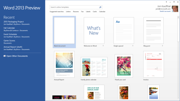
It gives the following screen once all the installation is done.
As you can see from the images the logo has been changed for office 2013 too.
The New User Interface
The Office 2013 user interface isn't markedly different from the one in Office 2010: The
ribbonremains front and center, though the text and the icons inside it are a bit larger and are spaced farther apart. These changes take better advantage of large monitors and touchscreen displays. Nevertheless, the ribbon isn't too big for an average laptop display, even with the addition of two new tabs: Design and Developer (actually, the Developer tab is present in Office 2010, but it's hidden by default).
 If you're familiar with the ribbon user interface from Office 2007 and Office 2010, you’ll feel right at home with Word 2013.
Though I've used a number of all-in-one computers with touchscreens over the past few years, I don't use the touch interface very often. Perhaps I'm just a creature of habit, but it doesn't feel natural to take my fingers off the mouse to stab them at icons on the screen (or maybe my fingers are just too fat to be accurate). In any event, though I tried hard to use the ribbon with my finger, I kept returning to the mouse. The UI delivers more benefits on tablet platforms, but it doesn't feel any less natural when used with a mouse.
New and Cool Word Features
Microsoft has made a number of cool, interesting, and very useful improvements to Word 2013.

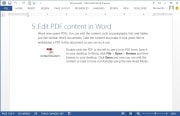
 The Embed PDF feature in Word.
On the usefulness front, you can now import a PDF directly into Word, edit it as a Word doc, and then save it as either a Word doc or a PDF. Not only do imported files retain all of the original documents' formatting--including headers, columns, and footnotes--but elements such as tables and graphics can be edited in Word as such.
Import a PDF file containing a table, for example, and you can edit the table just as though you had created it in Word from scratch. You can also embed a PDF file in a Word doc.

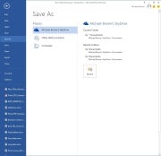
 Microsoft expects that people will want to save all of their files to the cloud. Your SkyDrive account is listed first, then
Another cool feature is the ability to connect to online resources and bring them inside your documents. For example, you can use Bing to search the Web for videos, without leaving Word, and then embed the HTML code for that video in your document.
Link your SkyDrive account to your Flickr account, and you can jump to your online photo collection and embed photos directly in the document--again, without ever leaving Word.
Embedding a screenshot from an app running on your PC is even easier: Click Insert > Screenshot, and a window with thumbnails of every window open on your desktop will become visible. Click the image you want, and it will appear wherever your cursor is.
When you embed an image or a video in a document, you can grab that element and move it around the document and watch as your text automatically reflows around it in real time.
Word Collaboration Features
When you're collaborating with other people on a document, being able to track the changes that each person makes is critical. This becomes much easier to do in Word 2013, thanks to a new feature called simple markup view.
A red vertical line in the left margin indicates that changes have been made to the document, while a word balloon in the right margin indicates the presence of a comment. Click on the vertical line to reveal both the edit changes and the comments; click on the word balloon to show just the comments.

Microsoft has also added a new viewing mode, called Reader. When you view a document in this mode, each paragraph has a small triangle in front of it. Click the triangle after you've finished reading its associated paragraph, and the paragraph will collapse so that more text will appear, without your having to scroll to another page.
I haven't had time to explore every new feature of Word 2013, but I like what I've seen so far. It looks as though Microsoft has significantly improved the application, adding some great new features without mucking anything else up in the process. Nevertheless, my opinion at this stage is based on very limited time with the product.
Excel 2013
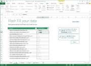
Like the new version of Word, Excel 2013 feels fresh yet comfortingly familiar. Microsoft has added several new whiz-bang data-analysis tools, including one called Flash Fill. When you take an element of data that you've already entered in one column and enter it in a second column, Flash Fill will predict that you intend to do that for every value in the second column, and will offer to fill in the second column for you accordingly.

 Excel's Flash Fill feature will notice patterns in your data entry, predict what you intend to do next, and then offer to fill in the rest of the data for you.
Microsoft provided a sample two-column spreadsheet to demonstrate how this feature works. The first column contained email addresses in which each person's address was formatted as first-name.last-name@domain-name. The second column was to be used to store each person's first name.
Though that isn't the most realistic scenario imaginable, it works. You establish the reference example by typing the first name of the first person in the email address column; then, as you begin typing the second person's first name, Excel predicts that you want to do the same for every other value in the first column and offers to do just that automatically. Press the Enter key, and the second column automatically fills with first names.
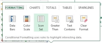
Colors and symbols can help you analyze data more quickly, and Excel 2013's new Quick Analysis tool uses these elements to identify and highlight trends and changes. Select the rows and columns that you wish to have analyzed, click the icon that appears in the bottom right corner, and choose the conditional formatting that suits your needs. Instead of looking at rows and columns of gray numbers, you'll instantly see a spreadsheet formatted with color scales, bars, and icons.
 Excel’s Quick Analysis tool automatically suggests conditional formatting that will help you visualize data locked in your spreadsheets.
Charts and graphs provide another easy way to visualize data, and spreadsheet software has long permitted users to generate charts and graphs based on the data they enter into its rows and columns.
Excel 2013's new Quick Analysis tool will automatically suggest the most appropriate types of graphs--bar, pie, scatter, and so on--based on the data set that you select.
My early impressions of Excel 2013 are about as favorable as my corresponding impressions of Word 2013. Microsoft seems to have introduced some solid new features without imposing a difficult learning curve. Take that, ribbon haters.
We'll take a closer look at Outlook, Powerpoint, OneNote, and the rest of the suite soon.
--PCWorld Senior Editor Michael Brown
Office 2013 and Office 365 on a Tablet: First impressions

Microsoft is betting heavily on the idea that tablets are the future of PCs. Like Windows 8, Office 15 was built from the ground up to take advantage of a tablet's unique features, while at the same time addressing the limitations of the touchscreen interface for creating content.
I ran Office 13 through its paces on a Samsung Series 7 Slate PC running Windows 8 Consumer Preview to see how well it performs on a tablet. Bear in mind that this tablet runs Windows 8 Pro, not Windows 8 RT, and that Office 2013 and Office 365 differ from the Office for RT apps that will be available on ARM-based Windows 8 tablets.
Microsoft has done a great job of making the tools and functions of the various Office applications accessible from a touchscreen interface without lessening the capabilities. For example, holding your finger on a misspelled word will pull up Office's list of possible corrections; and holding your finger on virtually anything brings up the options you'd normally find by right-clicking a mouse.
 Microsoft did a nice job of fitting all of Word's functions into the screen space of a tablet.
sometimes find that the options on the ribbon interface were hard to tap. The buttons are a bit small for my fingers, and you can't pinch-to-zoom to enlarge the ribbon in Office 2013. On the other hand, you can make the ribbon bar disappear to maximize the area available for your document--in both Office 2013 and Office 365--which is nice.
The Office 2013 suite I installed on the tablet included Word, Excel, PowerPoint, OneNote, Outlook, Publisher, Access, Lync, and a couple of bit players. The only apps available within Office 365, however, are Word, Excel, PowerPoint, and OneNote. Outlook exists in Office 365 as well, but the option was grayed out on the software I worked with.
One thing that I like about working with Office on the tablet is more a function of Windows 8 and/or the hardware its running on than of Office itself. The touchscreen virtual keyboard is sensitive and fluid enough to allow me to type at very nearly full speed. Also, tapping the symbols and numbers button brings up an actual number pad, which is much more efficient for entering figures in an Excel spreadsheet.
That said, it was a little annoying to have to tap the keyboard icon at the bottom of the display to open the virtual keyboard. It would have been nice if Office applications had recognized when I tapped on a text field, and responded by automatically opening the virtual keyboard. Perhaps, though, Microsoft wanted to respect the limited screen real estate of the tablet and let users navigate documents without having the keyboard pop up all the time.
Overall, the experience is solid. Using it differs from using a mouse and keyboard with a traditional PC, but it's a functional arrangement. Microsoft has obviously invested a lot of thought and effort in ensuring that the tablet experience that Office offers is worthy of the Microsoft Office name.


